Fashion is often portrayed as a world of rules. Wear this. Avoid that. Follow the trends. Dress your age. Yet true style has never been about strict guidelines or limitations. The most stylish people aren’t those who follow every fashion rule—they’re the ones who understand what works for them and wear it with confidence.
As we move through our fifties, sixties, seventies, and beyond, our relationship with clothing naturally evolves. We become less interested in chasing every trend and more interested in finding pieces that make us feel comfortable, confident, and authentically ourselves.
One of the biggest factors influencing how clothing looks on us is color.
The colors that flattered us in our twenties may not have the same effect decades later. This isn’t because aging diminishes beauty. Quite the opposite. As our hair color, skin tone, and facial contrast naturally change over time, certain shades begin working differently with our features.
The good news is that a few thoughtful color adjustments can instantly brighten your complexion, soften harsh contrasts, and create a more polished appearance without requiring a complete wardrobe overhaul.
Let’s explore five colors many style experts recommend wearing more carefully after age 50—and the beautiful alternatives that often prove even more flattering.
Why Color Matters More Than Ever After 50
Before diving into specific shades, it’s important to understand why color has such a significant impact.
As we age, several natural changes occur:
- Skin may become thinner and more translucent.
- Natural pigmentation can soften.
- Hair may turn silver, white, or gray.
- Facial contrast often decreases.
- Skin undertones may become more noticeable.
Because of these changes, colors worn near the face can either enhance your natural radiance or unintentionally highlight shadows, redness, fine lines, or uneven skin tone.
This doesn’t mean certain colors become forbidden.
Instead, it means choosing shades that work with your current coloring rather than against it.
The goal isn’t to look younger.
The goal is to look vibrant, healthy, and confident.
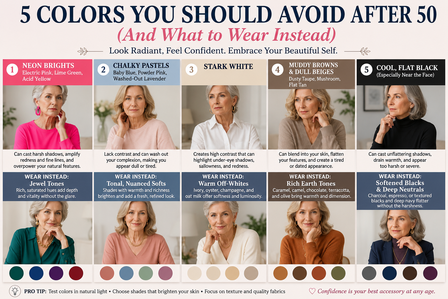
1. Neon Brights: Bold But Often Overwhelming
Why Neon Colors Can Be Challenging
Neon shades such as:
- Electric pink
- Lime green
- Acid yellow
- Fluorescent orange
- Bright chartreuse
create intense visual contrast.
These highly saturated colors reflect light directly onto the face and can overpower mature features.
Instead of highlighting your natural beauty, neon colors often become the center of attention themselves.
Many women discover that these shades:
- Emphasize skin redness
- Draw attention to fine lines
- Create harsh shadows
- Compete with facial features
The result can feel overwhelming rather than flattering.
What to Wear Instead: Jewel Tones
Jewel tones offer the same richness and energy without the harshness.
Consider:
- Emerald green
- Sapphire blue
- Ruby red
- Amethyst purple
- Garnet
- Teal
These colors add sophistication while still making a statement.
They provide depth and elegance that complement mature skin beautifully.
Silver hair, in particular, looks stunning against jewel tones because the cool richness creates a striking yet harmonious contrast.
2. Chalky Pastels: Soft But Potentially Washing You Out
Why Pale Pastels Can Be Problematic
Many women naturally gravitate toward soft pastel colors because they seem gentle and feminine.
Common examples include:
- Baby blue
- Powder pink
- Mint green
- Pale lavender
- Soft peach
However, extremely pale versions of these shades often lack enough depth to create flattering contrast.
When paired with lighter hair and mature skin, chalky pastels can blend into the complexion rather than enhance it.
The result may leave skin looking:
- Tired
- Dull
- Washed out
- Less vibrant
What to Wear Instead: Rich Soft Colors
Rather than abandoning soft colors entirely, choose versions with slightly more depth.
Excellent alternatives include:
- Rose quartz instead of baby pink
- Dusty rose instead of pale pink
- Soft periwinkle instead of powder blue
- Sage green instead of mint
- Mauve instead of lavender
These nuanced shades maintain softness while adding enough richness to brighten the face.
They create a refined and modern appearance that feels fresh rather than faded.
3. Stark White: Elegant Yet Surprisingly Harsh
Why Pure White Isn’t Always Ideal
Few colors seem more timeless than crisp white.
Yet pure optical white can be surprisingly unforgiving.
The intense brightness creates strong contrast against the skin, which may:
- Highlight dark circles
- Emphasize wrinkles
- Accentuate redness
- Draw attention to uneven pigmentation
While white shirts remain classic wardrobe staples, the brightest versions can sometimes appear stark rather than elegant.
What to Wear Instead: Softer Whites
Fortunately, numerous alternatives provide the same clean sophistication.
Consider:
- Ivory
- Cream
- Oyster
- Champagne
- Vanilla
- Oatmeal
- Soft pearl
These shades soften the transition between fabric and skin.
The result is often more flattering and luminous.
Many women are amazed by how much healthier their complexion appears simply by replacing bright white with ivory.
The Luxury Effect
Interestingly, softer whites often look more expensive than stark white.
Designers frequently use cream, pearl, and ivory tones because they create warmth and dimension while maintaining elegance.
4. Muddy Browns and Flat Beiges
Why Some Neutrals Can Age an Outfit
Neutrals are wardrobe essentials.
However, not all neutrals are created equal.
Certain dull shades can drain life from the complexion, especially when worn close to the face.
Examples include:
- Dusty taupe
- Flat beige
- Muddy brown
- Grayish tan
- Dull mushroom shades
These colors often lack vibrancy and can blend too closely with skin tones.
Instead of providing contrast, they may flatten facial features and create a tired appearance.
What to Wear Instead: Rich Earth Tones
Earth tones remain incredibly flattering when they contain warmth and depth.
Excellent choices include:
- Camel
- Caramel
- Cognac
- Chocolate brown
- Terracotta
- Rust
- Olive green
- Cinnamon
These colors provide structure while enhancing warmth in the skin.
They also pair beautifully with silver, blonde, brunette, and auburn hair.
Rich earth tones never seem to go out of style because they connect naturally with human coloring.
5. Cool Flat Black Near the Face
Why Black Isn’t Always the Best Neutral
Many women consider black their safest color.
It’s slimming.
It’s versatile.
It’s timeless.
Yet surprisingly, black can sometimes be one of the least forgiving colors after 50.
A cool, flat black positioned directly beneath the face can create:
- Deep shadows
- Increased contrast
- Emphasized under-eye circles
- A harsher appearance
This effect is particularly noticeable on individuals with lighter skin or silver hair.
What to Wear Instead: Softer Dark Neutrals
Rather than abandoning black entirely, consider softer alternatives.
These include:
- Charcoal gray
- Espresso brown
- Deep navy
- Soft graphite
- Dark plum
These colors provide the sophistication of black while creating a gentler frame around the face.
If You Love Black
You don’t have to give it up.
Instead:
- Wear black away from the face.
- Add a colorful scarf.
- Choose textured fabrics.
- Layer with jewelry.
- Pair black with flattering makeup tones.
Texture makes a huge difference.
Velvet, silk, knitwear, and textured fabrics soften black considerably.
Understanding Your Personal Coloring
No article can determine the perfect colors for every individual.
Personal coloring depends on several factors:
Skin Undertone
You may have:
- Warm undertones
- Cool undertones
- Neutral undertones
Hair Color
Hair significantly affects how colors interact with the face.
Whether your hair is:
- Silver
- White
- Blonde
- Brunette
- Auburn
certain shades will naturally harmonize better than others.
Eye Color
Eye color also influences color compatibility.
The right shade can make eyes appear brighter and more vibrant.
Style Tips for Looking Radiant at Any Age
Use Natural Light
When evaluating clothing colors, always look in natural daylight.
Store lighting can distort colors dramatically.
Pay Attention to Your Face
The best color test is simple.
Hold a garment near your face and ask:
- Does my skin look brighter?
- Do my eyes appear clearer?
- Do I seem more energetic?
If the answer is yes, you’re likely on the right track.
Focus on Contrast
Many women benefit from maintaining some contrast in their outfits.
Too little contrast can appear dull.
Too much can appear harsh.
Finding the balance creates harmony.
Experiment Freely
Age should never limit personal expression.
If you adore a particular color, wear it.
Simply consider adjusting the shade, intensity, or placement.
Style should always feel joyful rather than restrictive.
Fashion After 50: Confidence Is the Most Flattering Color
The most beautiful thing about personal style after 50 is that it often becomes more authentic.
By this stage of life, many women have stopped dressing to impress others and started dressing to reflect who they truly are.
That’s powerful.
Confidence transforms clothing more effectively than any trend ever could.
A woman who feels comfortable and happy in what she’s wearing naturally appears more attractive.
No color chart can compete with that.
Final Thoughts
Fashion after 50 isn’t about hiding age.
It’s about enhancing the beauty that already exists.
Small adjustments in color choices can make a remarkable difference in how clothing interacts with your complexion, hair, and natural features.
Swap neon for emerald.
Choose ivory over stark white.
Replace muddy beige with warm camel.
Consider navy instead of flat black.
Most importantly, wear colors that make you feel alive.
Because true style has never been about looking younger.
It’s about looking like the very best version of yourself.
And that only gets better with age.
More Blog
- Drinking Water on an Empty Stomach — What Science Actually Supports (No Hype, Just Facts)
- Waking Up Between 3 and 5 AM? It Might Be Your Soul Trying to Talk to You
- What a “Bleach” Patch on Your Underwear Really Means — And Why It’s Actually a Good Sign
- This Drink May Weaken Your Bones From The Inside — But Everyone Drinks It Anyway