If you’ve ever traveled through Sedona, Arizona, you may have noticed something unusual.
Among the spectacular red-rock formations, desert landscape, and Southwestern architecture stands a familiar fast-food restaurant — but something about it looks different.
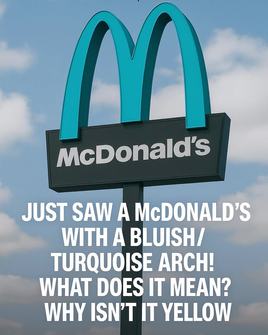
The famous McDonald’s arches aren’t golden.
They’re turquoise.
At first glance, it may seem like a small design choice. But the story behind those unusual arches offers an interesting lesson about how a global brand can adapt its appearance to fit the character of a local community.
A Very Unusual McDonald’s
McDonald’s is one of the most recognizable brands in the world.
Its golden arches are so familiar that you can often identify a restaurant from the sign alone.
So seeing turquoise arches instead of the traditional yellow immediately catches your attention.
The unusual McDonald’s is located on West U.S. Highway 89A in Sedona, a community famous for its dramatic red-rock landscape.
The contrast is striking.
Instead of competing with the surrounding scenery, the restaurant’s signage uses a softer turquoise color that fits more comfortably into the visual character of the area.
It Started With a Local Design Vision
The story goes back to the early 1990s.
According to the Sedona McDonald’s own account, discussions with city staff began in 1991, when the proposed restaurant was initially envisioned with the familiar McDonald’s appearance.
But Sedona officials had a different design vision.
The city wanted new development to harmonize with the surrounding shopping center and reflect Southwestern architectural elements and local design guidelines.
Sedona’s development regulations are designed in part to preserve the community’s scenic beauty and distinctive character. The city’s Land Development Code specifically addresses development standards, signs, and design guidelines.
That meant the restaurant couldn’t simply be treated like another location in an ordinary commercial district.
Its appearance mattered.
Why Turquoise?
The discussion eventually turned to the restaurant’s famous sign.
Rather than using the traditional bright yellow arches, local planning staff advocated for a sign that better reflected the aesthetics of the surrounding shopping center and Sedona’s Southwestern environment.
The solution was turquoise.
According to the restaurant’s own history, the city and McDonald’s ultimately agreed on the distinctive color during the signage approval process around 1992.
The restaurant opened in 1993 with its unusual teal-colored arches.
And that small design decision turned into one of Sedona’s most recognizable curiosities.
It Wasn’t Simply About Changing a Logo
It’s tempting to tell the story as though Sedona simply ordered McDonald’s to change its famous golden arches.
The reality is a little more nuanced.
The restaurant had to go through the local planning and design process, and the final appearance resulted from discussions between the business and city officials.
That’s an important distinction.
Sedona’s approach was part of a broader effort to maintain a recognizable community character rather than allowing every development to look exactly like it would anywhere else.
The turquoise arches became a practical compromise between a global brand and a very distinctive local setting.
A Global Brand Meets a Local Landscape
There’s something interesting about this particular example.
McDonald’s has spent decades building one of the world’s most recognizable visual identities.
The golden arches are not just decoration. They’re part of the company’s global branding.
Yet in Sedona, that identity was adapted.
The restaurant still looks unmistakably like McDonald’s. The familiar architecture and branding remain recognizable.
But one important visual element was changed to better fit the surroundings.
That’s what makes the location so memorable.
It demonstrates that adapting to local circumstances doesn’t necessarily mean abandoning a brand’s identity.
Sometimes it simply means knowing which details can change.
Why Sedona Cares So Much About Appearance
Sedona isn’t an ordinary landscape.
Its red sandstone formations are one of the defining features of the community, and the city has developed rules intended to protect scenic beauty and community character.
Its Land Development Code includes standards governing buildings, signs, development, and design.
The goal isn’t necessarily to prevent development.
It’s to make development fit more comfortably into the environment.
That philosophy can be seen throughout Sedona, where building colors, architecture, signage, and other visual elements are often considered in relation to the surrounding landscape.
The Turquoise Arches Became an Attraction
What began as a design compromise eventually became part of Sedona’s identity.
The turquoise arches are now widely recognized as a distinctive feature of the city, and visitors frequently stop to photograph them.
The restaurant’s own history describes the arches as having become a symbol of Sedona and notes that they have even appeared in McDonald’s advertising.
The unusual sign essentially became a piece of local visual culture.
People don’t just see it as another McDonald’s.
They see it as the Sedona McDonald’s.
Why the Story Still Matters
At first, the turquoise arches might seem like nothing more than an amusing travel fact.
But there’s a bigger idea hiding behind them.
Communities have identities.
A town’s landscape, architecture, colors, history, and traditions can make it feel different from everywhere else.
When large companies enter those communities, they don’t necessarily have to erase that individuality.
They can adapt.
And sometimes a small adjustment — even changing the color of a famous sign — can allow a business to become part of a place rather than simply being dropped into it.
A Lesson in Respecting Place
The story of Sedona’s turquoise arches isn’t really about hamburgers.
It’s about the relationship between commerce and community.
A global company brought a familiar brand to a very distinctive environment.
Local officials wanted the new development to respect the character of that environment.
Instead of ending the conversation there, the two sides found a design solution.
The result is something neither side would have created independently:
A McDonald’s that still looks like McDonald’s, but also looks unmistakably at home in Sedona.
The Beauty of Being Different
In a world where the same stores, restaurants, signs, and buildings can appear in cities thousands of miles apart, local character can be easy to overlook.
That’s why the turquoise arches are more interesting than they might initially appear.
They remind us that uniformity isn’t always necessary.
A familiar brand can still leave room for a place to express itself.
And sometimes, the smallest visual change can make the biggest difference.
So if you ever find yourself driving through Sedona and spot those unusual blue-green arches, take a second look.
They’re more than an unusual McDonald’s sign.
They’re a small example of what can happen when a global brand and a local community find a way to make room for each other.
And perhaps that’s the real beauty of Sedona’s turquoise arches:
They didn’t make the landscape look more like McDonald’s. They allowed McDonald’s to look a little more like Sedona.
More Blog
- Drinking Water on an Empty Stomach — What Science Actually Supports (No Hype, Just Facts)
- Waking Up Between 3 and 5 AM? It Might Be Your Soul Trying to Talk to You
- What a “Bleach” Patch on Your Underwear Really Means — And Why It’s Actually a Good Sign
- This Drink May Weaken Your Bones From The Inside — But Everyone Drinks It Anyway