
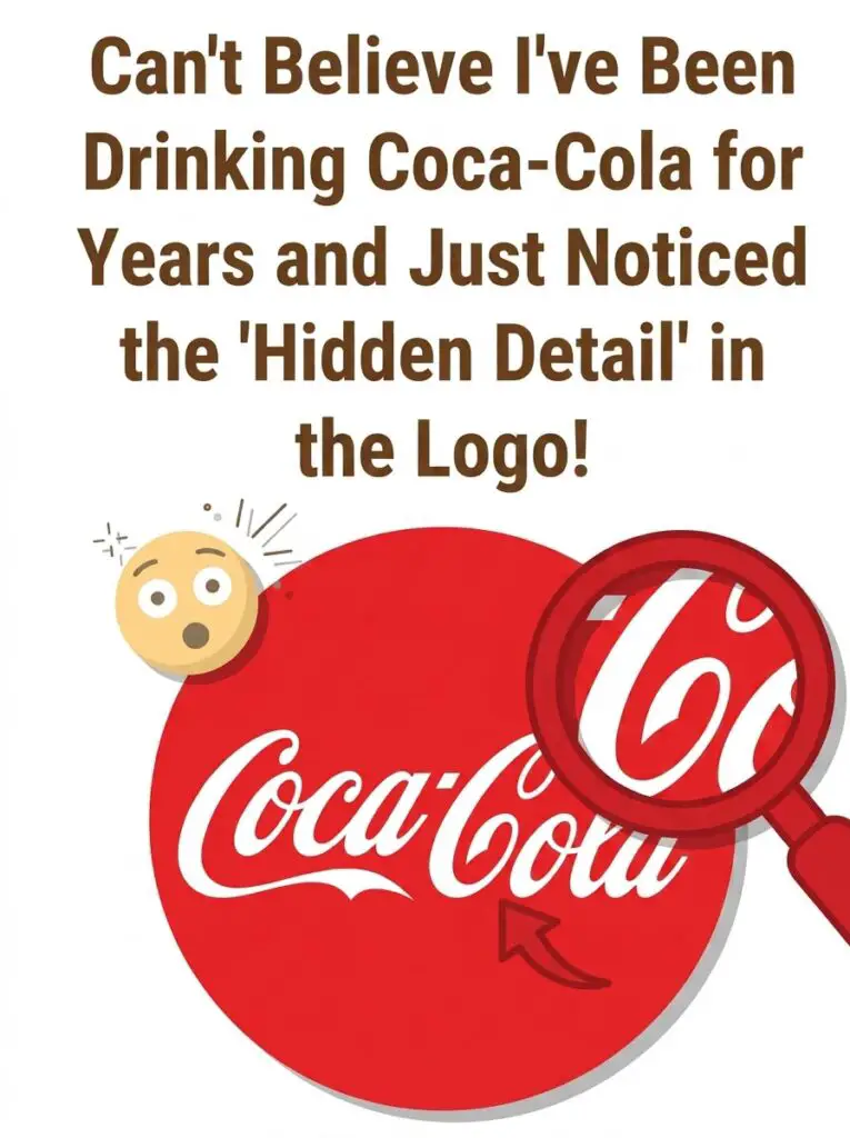
There are few logos in the world as recognizable as the iconic Coca-Cola script. It has appeared on bottles, cans, billboards, and advertisements for well over a century, making it one of the most familiar brand symbols ever created.
Yet a viral image has many people taking a second look at the famous logo after discovering what appears to be a hidden detail they had somehow overlooked for years.
If you’ve never noticed it before, you’re certainly not alone.
The Hidden Detail Everyone Is Talking About
The viral image encourages viewers to focus on the second lowercase “o” in the word “Coca.” When you examine the flowing script closely, especially the negative space inside the letter, an unexpected shape begins to emerge.
Some people believe it resembles the neck of the classic Coca-Cola glass bottle. Others see a rolled banner, while a few even interpret it as a subtle smiling face created by the surrounding curves of the lettering.
Whether you immediately spot the hidden shape or not, it’s a fascinating reminder that familiar designs can still surprise us after years of seeing them almost every day.
Brilliant Design or Pure Coincidence?
The Coca-Cola logo dates back to 1885, when Frank Mason Robinson, the bookkeeper for the drink’s inventor, created the famous Spencerian script. Robinson believed that the two capital “C”s would look attractive in advertisements, and his handwritten design became one of the world’s most enduring logos.
Because the logo was drawn by hand using elegant calligraphy, many design experts believe the hidden shapes people notice today are simply a byproduct of the script’s decorative flourishes rather than intentional design elements.
However, Coca-Cola has embraced unexpected visual discoveries before. During a marketing campaign in Denmark, the company famously highlighted how the negative space within the word “Cola” resembled the Danish flag, turning an accidental resemblance into a memorable advertising campaign.
Why Do We Notice These Things So Late?
Psychologists explain this phenomenon with a concept called pareidolia. It’s the brain’s natural tendency to recognize familiar patterns, faces, or objects in random shapes and designs.
Because we instantly recognize the Coca-Cola logo as a complete word, our brains rarely examine each individual letter. We process the entire logo automatically, causing tiny details to fade into the background.
Only when someone points out a specific area—or highlights it with a magnifying circle—do we suddenly notice something that may have been hiding in plain sight all along.
A Logo You’ll Never See the Same Way Again
Whether the hidden detail was intentionally created or simply the result of beautiful handwriting, it has sparked conversations across social media and reminded millions of people just how powerful visual perception can be.
The next time you pick up a bottle or can of Coca-Cola, take another look at the famous script. You may discover a detail you never noticed before—or perhaps you’ll see something completely different from everyone else.
That’s part of the fun. Sometimes the most familiar designs still have a few surprises waiting to be discovered.
Ingenious Design or Happy Accident?
The internet has always loved uncovering hidden details in famous logos. From the arrow cleverly concealed inside the FedEx logo to the mountain in the Toblerone logo hiding the silhouette of a bear, people enjoy discovering design elements that have been sitting in plain sight for years.
That naturally raises the question: was the hidden shape inside the Coca-Cola logo placed there on purpose?
The answer isn’t entirely clear.
The famous Coca-Cola script was created in 1885 by Frank Mason Robinson, the bookkeeper for the company’s inventor. Robinson chose the elegant Spencerian handwriting style because it was popular for business correspondence during the late nineteenth century. He believed the flowing letters and the two large capital “C”s would create a distinctive logo that people would easily remember.
Since the logo was drawn entirely by hand, many historians and graphic design experts believe the unusual shapes people notice today are simply beautiful accidents created by decorative pen strokes rather than carefully planned hidden images.
Even so, accidental discoveries often become part of a brand’s story. Over the years, Coca-Cola has embraced the fascination surrounding its logo, recognizing that these conversations keep people looking at one of the world’s most recognizable trademarks.
The Psychology Behind Hidden Images
One reason these discoveries spread so quickly online is because they tap into the way our brains naturally process information.
Psychologists refer to this as pareidolia, a phenomenon where people recognize meaningful images in random patterns. It’s the same reason some people see faces in clouds, animals in rock formations, or familiar shapes on the surface of the moon.
Instead of analyzing every curve and line individually, our brains process familiar logos as complete objects. After seeing the Coca-Cola logo thousands of times throughout our lives, we rarely stop to inspect each letter.
That’s why a simple magnified image can suddenly reveal something we’ve overlooked for decades.
Why Hidden Logo Details Fascinate Us
Hidden design elements create a sense of discovery. They make us feel as though we’ve uncovered a secret that millions of other people missed.
Whether the hidden detail was intentional or completely accidental almost becomes secondary. The excitement comes from seeing something familiar from a completely different perspective.
Social media has amplified this experience. One viral post can inspire millions of people to grab the nearest soda can and inspect the logo for themselves. Before long, comment sections fill with people debating what they see.
Some viewers insist they can clearly recognize the neck of a glass Coca-Cola bottle. Others believe it resembles a ribbon, a smile, or an abstract swirl. A few don’t see anything unusual at all.
Interestingly, there is no universally “correct” answer. Human perception differs from person to person, making discussions like these surprisingly entertaining.
Other Famous Logos with Hidden Meanings
The Coca-Cola logo isn’t the only famous design that has sparked curiosity.
The FedEx logo famously contains an arrow between the “E” and the “x,” symbolizing speed and precision.
The Toblerone logo hides the outline of a bear inside the mountain, representing the Swiss city of Bern, often called the “City of Bears.”
The Baskin-Robbins logo cleverly highlights the number 31 within the initials, representing the company’s original promise of offering 31 different ice cream flavors.
The Amazon logo features a smile-shaped arrow stretching from the letter “A” to the letter “Z,” suggesting customers can find everything from A to Z while also creating the appearance of a happy smile.
These subtle details demonstrate how thoughtful design can add another layer of storytelling to a simple logo.
A Logo You’ll Never Look at the Same Way Again
Whether the hidden shape inside the Coca-Cola logo was carefully planned or simply emerged from elegant handwriting, it has certainly captured the internet’s imagination.
Sometimes we become so familiar with everyday objects that we stop noticing the small details that make them unique. A fresh perspective—or a simple magnifying circle on social media—is all it takes to reveal something that has been hiding in plain sight for generations.
The next time you hold a bottle or can of Coca-Cola, take a few extra seconds to study the famous script. You may notice the hidden detail immediately, or you may discover an entirely different shape that no one else has mentioned.
That’s the beauty of visual perception. Even after more than a century, one of the world’s most famous logos continues to surprise people and spark conversations around the globe.